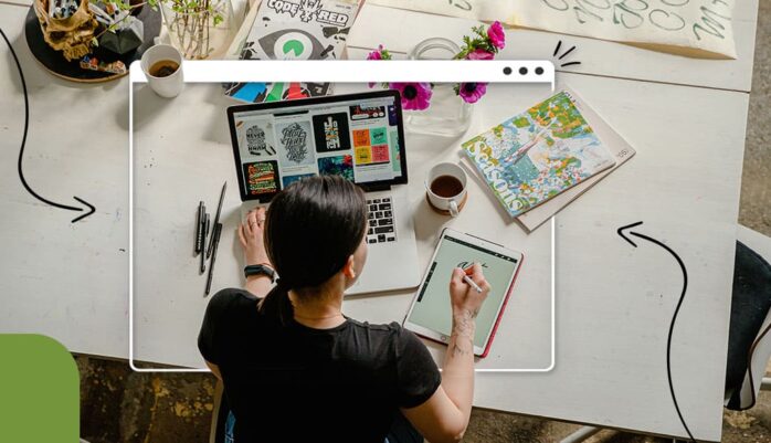
Logo is a trademark of the company. It should be unique and convey the right message to the audience. Brand’s icons show the idea of the brand, which helps attract the targeted audience. As the competition in every industry goes up day by day. It needs to create appealing and dreamy logos that instantly match the audience’s vibes. The quality online templates are available to create the best logo. It allows you to create an exceptional branded logo within the matter of a few minutes. On the other hand, professional premiumlogodesign.com offers exceptional services. Knowing all the latest market trends, it helps to achieve the business targets.
Mistakes Need to Avoid While Creating Logo
As per the reports on Logo Statistics and Design Trends in 2022, 67% of the brands or companies are recognized by their logo. These statistics show that icons are the front face of the brand. Some common mistakes are suggested by the experts that need to be avoided while creating an innovative logo. This blog helps you create an exceptional and professional business logo without a hitch. The most common mistakes are listed below.

Creating Too Much Complex Icons
One of the most common mistakes is the use of too much abstract art to create a unique and eye-catching logo. But in reality, it makes the logo too complex and fails to connect the targeted audience vibes. According to the Business and Branding Statistics, 30% of the buyers lose interest after seeing too many complexities in logos. Alternatively, a simple logo design is easy to remember and also gets more publicity. It gives the logo a classy and attractive look.
Unaware of the Targeted Audience
It needs to do in-depth research about the key audience and the market trends. Ignoring your actual audience when creating a logo is the biggest mistake of all. If you are going to build a brand logo that goes align with people of different age ranges. You need to spot your targeted audience group for anticipated results. For example, for children, brands add cartoon characters to their logos. It helps give a personalized effect to the icon.
Unscalable Logo Design
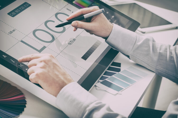
Ideally, when you create the logo, it can be used on different mediums, such as websites, shirts, pens, and notebooks. However, it is commonly observed that icon designs are inflexible. When it is inserted on different surfaces, it becomes blurry and pixelated. Alternatively, with the help of Logo Maker, you can create a scalable logo that can be used on different mediums.
Relying Blindly on Market Trends
The logos that are designed according to the current trend do not last long. After a specific time, these logos become outdated. For that reason, go for timeless logos, which help maintain a consistent brand image. Another option is to use two logos, one is a universal logo, and the other is a logo for specific articles. It allows you to follow trends and makes your image consistent.
Typographic Issues in Logo
It is a fundamental mistake to make the look of the logo innovative by choosing a ridiculous font style and size. Smashing Magazine shows that 45% of the logo designers narrow down the brand names. It negatively affects the readability of the logo. Instead of that, use Nova, Helvetica, and kerning font styles for a captivating logo. These fonts increase the readability and visibility of the logo.
Select Noisy Color Combination
Selecting too many colors to make the logo attractive is the wrong choice. Your brand theme helps to decide the color for a perfect logo. The use of excessive and too-bold color combinations don’t leave a positive effect on the audience’s eyes. To make the logo more charming, use purple, and blue instead of light shades. To add a girly effect, use pink and red shades. Similarly, to add masculinity, add gray and brown colors to the icon.
Too Inspired By Competitor’s Logo
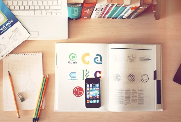
When you are doing market research for logo design. Avoid copying the competitor’s logo, which drastically reduces your impression among the audience. According to the Huddle Statistic, 34% of the logos are inspired by famous brands, which confuses the public. It promotes a negative vibe of your brand among key audiences. For that reason, try to create a distinctive and worth selling logo design that helps to gain more popularity. It shows your sense of individuality and uniqueness.
Use of Outdated Designing Elements
To create visual complexity, avoid using outdated elements, including excessive patterns, shadow effects, and outlines. Because these shape angles are not set to different mediums, they affect the quality of the logo as well. It gives a vintage vibe and less attracts the end audience. To avoid this mistake, use a professional design and layout to make the logo alluring. Try to use a simple and clear theme that makes the versatile look of the logo.
Unclear Intentions in Icon
A logo conveys your message to your audience. Beneath the font style to get the audience’s attention, some logo designers add objectionable content to get negative publicity. For example, targeting a specific religion and hurting holistically public sentiments. It damages the brand identity, and ruptures the business impression over the targeted audience. Avoid using such tactics to get public attention. Adopt innovative but positive ways to boost your brand.
Ignore Professional Logo Designer
The most prominent mistake is to avoid hiring professional graphic or logo designer services for business logos. By using low-quality templates, they mostly prefer to create a logo design. Such kinds of icons are not capable of portraying the brand’s stance in front of a targeted audience. For that reason, get the professional service that gives your brand logo a new dimension.
Conclusion
In the digital sphere, a logo is a brand trademark. It is crucial for every business. Logos represent the company and need to be flawless and eye-catching to attract customers. If you are looking to create your logo, many websites offer hundreds of templates and customization options. By incorporating unique symbols, shapes, and patterns, you can design a creative and appealing logo. It is important to avoid using double borders or shading patterns as they can make the logo unclear and affect its visual representation.


