In the world of retail, first impressions are everything. And when it comes to grabbing your customer’s attention, a well-designed label sticker can make all the difference! Whether you’re launching a new product or revamping an existing one, creating eye-catching label stickers is essential for effective branding. But where do you start?
In this blog post, we’ll share with you some top tips and tricks on how to design killer label stickers that will leave a lasting impression on your customers. So buckle up, and let’s dive in!
Understanding the Role of Label Stickers in Branding

When we dive into the ocean of brand communication, label stickers are a versatile, creative, and impactful asset. They are not just simple pieces of adhesive paper; instead, they serve as mini billboards for your brand, reflecting your brand personality, promise, and proposition.
From laptops to travel bags, they can turn any surface into an advertising space and amplify your presence, offering cost-effective, wide-reaching, and memorable branding opportunities.
Consider the impact of a well-designed label sticker on a product, say, a bottle of craft beer. The sticker not only provides vital information like the product name, ingredients, and expiry date but also communicates the brand’s uniqueness, authenticity, and ethos.
It might reflect the handcrafted nature of the product, a commitment to sustainability, or a playful, edgy tone. Essentially, it sets the product apart in a crowded marketplace and builds an emotional connection with the consumers.
Identifying Your Target Audience
Before embarking on the journey of design, it’s crucial to understand your target audience and solidify your brand identity. Your target audience’s preferences, behaviors, and needs should be the guiding light for your design process.
For instance, a younger, tech-savvy demographic might appreciate bold, modern designs with a quirky text, while a more mature, sophisticated audience might favor classic, minimalist aesthetics.
Your brand identity is another vital component to consider. It’s a unique blend of your brand’s mission, values, personality, and visual elements, which must be consistently communicated across all touchpoints.
A clear identity fosters recognition and loyalty, and your label stickers should be an extension of this. For example, if your brand promotes organic living, earth tones and nature-inspired motifs might be a good fit for your stickers.
Choosing Colors and Typography that Grab Attention

The world of colors and typography is a playground for designers, offering endless possibilities for creating eye-catching label stickers. When it comes to colors, it’s essential to understand color psychology, the study of how colors impact our perceptions and emotions. Bright, bold colors like red and yellow can evoke excitement and urgency, while softer shades like blue and green can create a sense of calm and trust.
Typography, the art of arranging type, is another critical element in design. It’s not just about legibility but also personality. Bold, big typefaces can make a strong statement, while elegant, serif fonts can impart a sense of luxury and sophistication. Also, consider the hierarchy of your text: the most important message should be in the largest or most distinctive font.
But remember, less is more. A common pitfall in sticker design is overloading it with too many colors and typefaces, which can confuse and overwhelm viewers. Stick to a harmonious color palette and a maximum of two complementary typefaces. This way, your sticker can make a powerful impact without overwhelming the senses.
Incorporating Eye-Catching Graphics and Images
Visual storytelling through graphics and images can elevate your design from good to great. Visual elements can captivate attention, stir emotions, and create lasting impressions, whether it’s an iconic logo, a striking illustration, or a beautiful photograph.
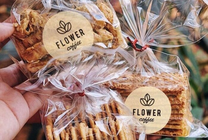
Images can also provide context. For instance, an image of a robust, steaming coffee bean can instantly convey the freshness and potency of your coffee brand. Or a serene landscape might reflect the tranquility offered by your wellness product. Remember to choose high-quality, clear images that align with your brand identity and speak to your audience.
Graphics, on the other hand, can add a layer of creativity and uniqueness to your sticker design. A distinctive logo can make your brand instantly recognizable, while illustrative elements like lines, shapes, or patterns can add depth and interest. But as with any design component, moderation is key. Avoid overcrowding your sticker with graphics and ensure they enhance rather than overshadow your brand message.
Creating Clear and Memorable Messaging
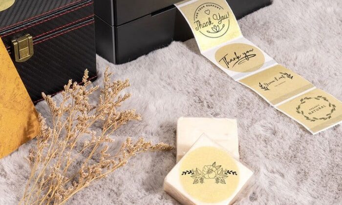
A sticker without a clear, memorable message is like a book without a story. It might look appealing, but it won’t leave a lasting impression. Your message could be your slogan, a compelling call to action, a witty one-liner, or even a powerful quote that embodies your brand’s ethos.
The trick to creating memorable messaging is to keep it simple, authentic, and engaging. Consumers are bombarded with an avalanche of brand messages every day, so you need to cut through the noise. A good rule of thumb is to keep your message short and punchy, ideally not more than seven words.
Consider incorporating an element of surprise or humor into your messaging. It not only makes your sticker stand out, but it also makes your brand feel more human and relatable. Lastly, ensure that your message aligns with your overall brand voice. If your brand voice is formal and professional, a casual, slangy message might feel out of place.
Maximizing the Use of White Space
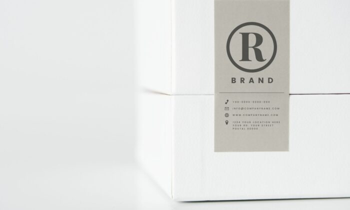
In the realm of design, white space is often the unsung hero. Also known as negative space, it’s the unmarked area around text, graphics, and other design elements. Far from being ’empty,’ white space provides breathing room for the design, enhancing readability, balance, and visual hierarchy.
When designing a label sticker, don’t fall into the trap of filling every inch of space with text, colors, and graphics. This can lead to a cluttered, confusing design that detracts from your key message. Instead, let your design elements breathe by allowing adequate white space around them.
The strategic use of white space can also guide the viewer’s eye to the most important parts of your sticker, like your brand name, logo, or call-to-action. This visual hierarchy can make your sticker more engaging and effective. Moreover, white space can create a sense of luxury and sophistication, making it a powerful tool for premium brands.
Selecting the Right Label Size and Shape
Size and shape may seem like minor considerations in sticker design, but they can significantly impact its effectiveness. The right size ensures your sticker is noticeable and legible without being intrusive. Consider the surfaces where your stickers might be placed – are they large spaces like laptops and suitcases or smaller surfaces like mobile phones and water bottles?
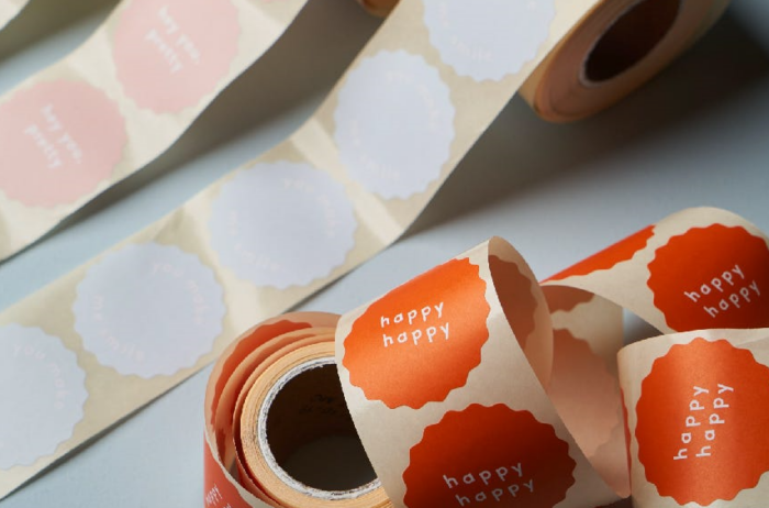
Shape, on the other hand, can add a distinct personality to your sticker. While standard shapes like rectangles and circles are versatile and cost-effective, custom shapes can make your stickers stand out and resonate with your brand identity. For instance, a bakery brand might opt for cupcake-shaped stickers, while a tech company might choose a shape that mirrors its logo.
However, when experimenting with size and shape, keep practicality in mind. Your sticker should still fit on a variety of surfaces and adhere well. Furthermore, the design elements – text, colors, and images – should work harmoniously within the chosen size and shape.
Summarizing

To sum up, designing eye-catching label stickers involves a careful interplay of understanding your brand and audience, crafting compelling visual and textual elements, and maintaining brand consistency. The result is a powerful branding tool that captures attention, evokes emotions and makes your brand unforgettable.


