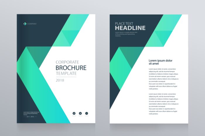
There’s more to writing a clear message beyond merely placing words on paper or a computer. A message must also appear attractive in today’s visually-focused culture. For instance, marketing executives invest a significant amount of money and time into creating advertisements that are both captivating and attractive. A training handbook will have pictures or illustrations to follow the step-by-step guidelines for readers. Most readers are used to having some sort of visual, like pictures or infographics. However, text must be curated and have a design aspect as well.
Designing a document involves deciding how and where to present each of its fundamental components in a way that makes its content clear and impactful. People understand information more rapidly and effortlessly whenever a document is professionally structured. The content and its argument are perceived more favorably by readers. Documents are designed as either print publications (handout types) or as digital media. For example, businesses of all types, including e-commerce companies such as Outvio, can use documents as print or digital documents. Document development is the same regardless of form.
Process of Developing a Document Design

The first thing to consider is the document’s purpose. The purpose of the document assists in defining how much information must be contained in it, as well as how it needs to be presented. When deciding the purpose, consider these key questions:
- What is the purpose of the document?
- Will the document inform, amuse, educate, or inspire the audience?
- After reading this document, what should readers take away from it?
- Is the goal for people to buy products, go to a conference, or pick up a new skill?
Here are some of the factors you need to consider:
The Audience
Identify the target audience and tailor the document to the features of the audience. For instance, if the material is for children, the document must be written for an elementary level. To attract the attention of a young audience, documentation will have to employ fewer words, cartoons, images, or games. Smaller print, more in-depth images, and headers are more appropriate for an older audience. To accommodate various degrees of visually impaired, the size or font may have to be bigger and more readable for older folks. There are some fonts that have been created exclusively for better reading.
Outline Content
The essential points of the document’s overview should be included. A strong outline provides a general strategy for the document. An outline that is very brief might be used if the document is just a brochure. An extensive overview may be required when the document is an instruction handbook.
Content Writing

The text should be concise for pamphlets or handouts. More information should be added to documents like newsletters, posters, or brochures.
Document Design
Once the content has been written, create an illustration of the document drawn by hand that includes all the text, photos, headings, and borders. Prior to producing the final version of the design, one must always attempt to represent thoughts. It’s crucial to consider how many pages it will include when designing.
Once a layout is created in the form of a thumbnail drawing, use computer tools to design the document. Simple software programs, like Microsoft Word, are able to create basic documents such as flyers. Basic newsletters or pamphlets can be designed using templates that can be found in MS Word or some other writing applications like OpenOffice Editor. But, these require layout and design tools such as Adobe InDesign for more complex documents.
A Guide To Getting Started With Design

If this is the first time designing a paper, organizing ideas into a professional-looking layout might be difficult to understand. Consider these suggestions to get started:
- Find good examples to learn from them: Considering powerful designs as examples is important because designers acquire skills by looking at how other people use strategies and solutions. It is helpful to examine: which commercials inside the newspapers or magazines are attractive? Which poster sticks out? What’s enjoyable about the most recent newsletter read?
- Don’t complicate things: Keeping it simple is the key. Usually, a simple design lets content stand out. Every good design must support the message rather than draw attention to itself. In general, don’t make things too complicated or intricate.
- Choose relevant images: Spend some time choosing a strong image (graphic or picture) to go with the words. Use an excellent image, for instance, if it helps understand the written word. Do not use images that are blurry or don’t get the point across.
Importance of Design Documentation
Using better document designs will improve the business’ images and boost efficiency. This enables engaging content that catches the attention of the intended audience. Here are some of the benefits of design documentation:
- Improves employee morale and productivity
- Makes resources more efficient
- Implements a streamlined documentation process
- The Design of Your Documents Makes Your Business Stand Out
Analyzing the Impact of Color and Layout in Corporate Documentation

The use of color and layout can make all the difference in how well a document communicates its message or intent. Color can be used to create contrast, highlight important information, and add visual interest. Layout helps organize information in ways that are easy to read, understand, and navigate.
Different colors and layouts can evoke certain feelings or emotions for different groups of people – what looks professional to one group may look outdated or too informal for another. It’s also important to choose typefaces which are legible and appropriate for the document’s purpose; this ensures that the reader is able to quickly access and process the information they need.
Conclusion
Design is an essential part of corporate documentation that can’t be overlooked. The look and feel of a document will make a huge difference in how it communicates with the reader. Color, layout, typeface, and accessibility should all be taken into account when designing a corporate document to ensure that it speaks clearly and resonates with its target audience. Additionally, incorporating analytics tools can help measure and monitor the effectiveness of documents over time so businesses can continue to improve their corporate documentation design.


