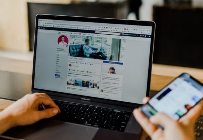
Your online presence matters more than ever. With so many businesses already online, standing out in the crowd and delivering your brand message can be a delicate task. One of the ways to stand out among the others is to use proper social media headers. The headers reflect your brand image, so take advantage of this feature and create the best visuals that speak of your business with pride.
When people open your profile, they will see the header image above your profile picture. Since this spot grabs attention, it is an ideal place to display your company’s benefits. Visuals are an excellent way to engage your audience, but keep in mind that your brand might suffer in case of incorrect use.
Your social media header should be clean and concise. Don’t consider it as if you should bombard the people with information about your company. This step can cause confusion and redirect their attention from the primary goal. The header design will depend on a few factors and mainly on your industry. While you are required to use your creativity if you are a musician, you don’t need it if you are a lawyer.
Things to avoid
Getting your social media headers right can be pretty challenging. One of the significant problems that you will encounter is pixelated visuals and low-quality graphics. These problems are caused by lousy sizing, leaving the header you spent so much effort on useless. The platform can ruin your visuals with their standard formatting process, resulting in a pixelated header that looks too cheap.
If you want to edit your visuals and resize the file, you will get across another problem. None of the sizing guidelines you will find will work perfectly for your project. Even if you scroll through google trying to find the right solution, it doesn’t have to mean that you will do it instantly. If you find the required image size for a platform, it might further crop it and decrease the quality. This happens because the image size might differ from the final uploaded version.
How to solve this problem? We recommend you go for the recommended size for each social media platform when designing a header. Further in this post, we will share the exact size requirements for each platform. Once you know them, you will create a perfect visual that looks clear. Some of the platforms might go forward and crop the photos, while others won’t do it. From our practice, we would recommend you leave some space for adjustment. This means that you should position the information and text in the center to avoid cropping.
While Twitter is pretty popular, it is often overlooked by brands trying to increase their online presence. With over 313 million active users per month, you shouldn’t ignore this platform. They have implemented some changes to their layout, so requirements have changed. The header photo appears when someone opens your profile, and it is the first thing that users will see, so make sure to stand out.
Twitter requires you to upload a header image with a size of 1,500 x 500 with a maximum of 5 MB. The platform also has requirements regarding the file format so that the best fits would be JPG, PNG, and GIF. If you want to establish a reputable brand image on Twitter, use a unique tool for creating high-quality graphics such as https://viewst.com/twitter-banner-maker.
Twitter’s image posts were also prone to cropping, a subject for joking among the users. If you are worried about the unexpected cropping, keep in mind that the network doesn’t crop the vertical images anymore. However, make sure to keep your pictures in the standard 16:9 or 4:3 to avoid cropping.
Facebook is the first social media choice for many, so creating an authentic brand profile will help you stand out. On Facebook, the photo that appears above your profile picture is called a cover photo. For the best result, attach a photo with the size of 820 x 312 pixels. If your image is smaller, it will be stretched and pixelated. It is important to note that the requirements remain the same for both personal and business accounts.
No matter your industry, Linkedin is a must for every company. It is the largest professional platform globally, which has different goals compared to other platforms. The primary purpose is to connect with industry professionals or hire fresh talents to help your business grow.
If you have a personal Linkedin account, the background image is an excellent way to introduce yourself. However, there are specific requirements you need to have in mind. Make sure that the file isn’t more than 4MB and comes with a size of 1584 x 396 pixels.
If you manage a company profile, keep in mind that the requirements won’t be the same as a personal profile. The main difference comes from the fact that the cover image takes ample space within your company profile. Despite having more space to showcase your company’s benefits for the consumer, this means that the required image size will be different. Opt for a size of 1128 x 191, with a maximum of 4MB.
For both company and personal profiles, the file format remains the same. You are required to attach a JPEG, GIF, or PNG format for both options.
Youtube

Youtube is an excellent way to reach your customer, regardless of the industry you belong to. The cover image will communicate the benefit of following your Youtube channel, so getting it right is crucial for your strategy. The image itself should stimulate the users to click the Subscribe button and engage with your videos. For this platform, a cover image with 2560 x 1440 pixels will work excellent. However, the way users view your cover image can vary across different devices.1546 x 423 pixels is a safe space that won’t get further cropping, which can work across various devices.


