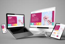
Designing a website is a big challenge; there is also the additional pressure to design a unique website that will most accurately represent your business and brand identity. No matter which design you choose, it is important to create and design a website that shows off your content in an intuitive way. Today’s businesses consider their design just as important as their content because their design will influence how their content is perceived.
- Productivity Tip: Most businesses invest heavily in developing content, neglecting the design in the process. Innovative web design coupled with a powerful message can put life into your site and brand while appealing to customers and making it easier for you to generate revenue.
In this article, we will discuss few key points on how to design a website that sticks out

- Acquire a memorable domain name: – It is important to choose a memorable domain name for your company. A good rule of thumb when choosing a domain name, try not to be too boring and plain! Choose something that will make you stand out in the sea of other competitors vying for attention on Google Search pages or Bing Ads searches. Make sure it is easy to spell as well so people can find what they are looking for quickly without having typos along the way.
Note: Try not to choose a plain domain name as companies with plain names run the risk of easily forgettable. It is also possible that they will not find a suitable domain name, as plain names are mostly booked. Try to choose a name that matches your company name and design; also make sure it is still easy to spell.
- A little bit of “inspiration” won’t hurt: – If you are in a situation, where you feel like the design process is becoming too repetitive or unoriginal, try looking at more niche-designs that are outside the popular domain. Many platforms exist that can provide website design inspiration, such as Editor X. You will be surprised how many creative designs can come out of this approach. As designers, we do our best to create website designs that are both aesthetically pleasing and memorable. However, we have to admit that there are times when we get our website design inspirations from other websites as well.

We bring you two of the most memorable design that are in use:
- Colorful Websites: In recent years, more people have been using bright colors in their designs because they want to attract attention and make their site stand out. Try to find a balance between monochrome, complementary and Analogous color schemes.
- Patterns: Some designers use patterns as an accent for website backgrounds or as backgrounds for navigation buttons. These patterns are usually made up of shapes and different geometrical layouts that corresponds with their offerings.
- Use CSS animation effects: – The appearance of websites on most modern browsers has also changed dramatically with the introduction of CSS animations. It will allow web designers to show service or products in a complex yet eye-catching way. CSS animations provide an opportunity for web developers to make a static website or webpage come to life. With just a few lines of code, animations can; add excitement and spice up boring designs. They allow designers to create richer and more interactive pages with an interface that is much more fluid than the old, traditional methods.

- Design a website for easy viewing: Designing a website layout for easy viewing can make it easier to find content or products, especially if there are any special features like scrolling text on certain pages. Being able to scroll through the homepage instead of having everything appear at once is convenient because visitors can scan quickly. They can see all options available to them, and hopefully convert into sales faster (depending on how well designed the website is).
It also means that your web design should be consistent across all pages, so that users will experience your website in a comfortable way. Users tend to move to different parts of your site to explore and search for something specific, so it should be clear and reasonable. The ease of navigation on your website should help to create a better user experience for your customers.
There are different elements that flow into a good website design, but the most important are the user experience, security and visual presentation. Website design is the key factor in whether users visit a website and convert to a brand. Designers and developers often make the mistake of creating a visually stimulating website at the expense of easy navigation, which you should avoid.

- Try experimenting with different colors: “What color should I use for my design?” Many of us have asked this question ourselves at some point. The answer: it depends on the type of business you’re running, and what emotions that particular shades might convey to your clients! You can’t go wrong with blue because this color conveys calmness; but if there are areas where customers will be frustrated or irritated (think about an online banking interface), then orange would be more appropriate in order to depict happiness–a perfect way to lighten up their moods!
Different shades might convey different emotions depending on what type of business one is attempting run. When designing the web page, care needs taken as colors may also relay certain messages not only through words but also by implication.

Conclusion
The primary step is to start with inspiration, ask yourself some relevant questions such as – what makes visitors to revisit. What do they enjoy about your product or service? These questions should be answered before deciding anything else about designing the website. There are many steps for creating a successful and unique website design, and it is important to remember that there are no set rules. The website’s design will change depending on the needs of the company or individual, so use these tips as a guide to help you create your own unique design.


