With online shopping growing rapidly, more and more people are preferring to order online instead of going to physical stores. The sheer convenience of online shopping has bribed consumers into avoiding in-person retail therapy. From makeup to clothes to electronics to camping gear to medicines, there’s virtually everything you can buy with a couple of taps on your smartphone.
But experientially, online shopping doesn’t even come close to shopping at an actual store. There is something quite unique about going store to store and making a day out of it. The experience of feeling a product in your hand or witnessing how it works in person can’t be replicated by websites.
Is your business suffering because of the e-commerce boom? This can be attributed to a number of reasons, including discounted online prices, poor in-store service and lack of product variety.
A lacklustre window display can be the reason for declining sales. It might be deterring customers from entering your store. Just like a catchy headline urges a person to click on a link, a window display lures in customers.
Check out our top tips for creating an attention-grabbing window display.

Know Your Target Audience
The first step to achieve an impactful display is understanding your target audience. Are your products catered to children? Do you retail to a universal audience?
The aesthetics of your display will depend on your target audience. For instance, a display for a children’s bookstore will be starkly different from a window display of an appliance store.
Understand your surroundings
Apart from your audience, your window display also depends on your surroundings. Is your shop located in a shopping complex or next to a busy road?
This factor will determine how much time passersby have to comprehend your display.
Therefore, it would be too ideal to focus on visual aesthetics in a fast-paced area rather than using words.

Pay Attention to Focal Point
A person naturally notices the centre, eye-level of a window display first. Therefore, the focal point of a window display should showcase the most important products. This space should be specially assigned to new releases.
Go Beyond Just Displaying Products
A window display isn’t just a showcase for all your products. It should be curated in a way that stops pedestrians in their tracks and entices them to walk in.
Incorporate fabrics, lighting, furniture, posters, props and so on to tell a story. There’s no such thing as too much creativity.
Spur Creative specialises in designing and manufacturing high-quality props for retail displays.
Choose the right colour palette
Different colours have the power to evoke different emotions in customers. For instance, green is usually associated with nature and serenity, while yellows give rise to the feeling of optimism. If you’re aiming for an eye-catching display, incorporate bright colours. On the other hand, if you want a display that will complement a wide range of products, do for a pastel palette.
Think Out Of the Box
Santa Clause? For Christmas? Groundbreaking.
You don’t want your display to get lost among a row of similarly decorated stores.
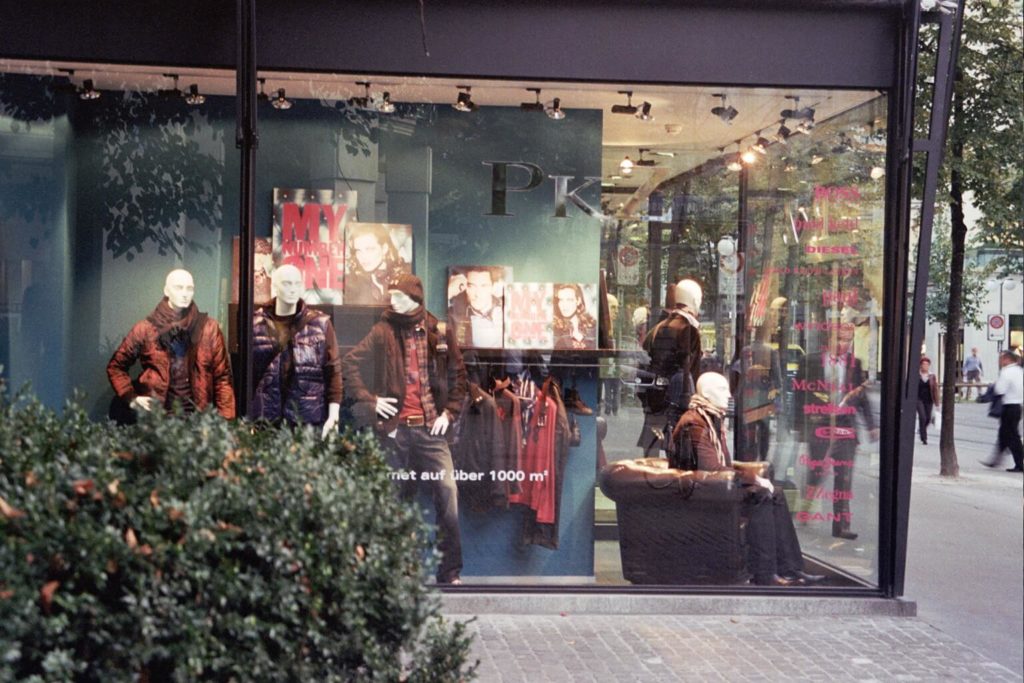
Think out of the box when it comes to seasonal window displays. Don’t go with the cliched orange and black for Halloween or winter wonderland for New Years. Dig a little deeper.
Keep It Simple
It’s crucial to find a balance when it comes to designing a window display. You need to find the right combination of main products and secondary props. Your display should make customers curious, not confused.
The products shouldn’t be overshadowed by other elements. The customers should be able to easily identify what your store is selling.
Switch It Up Frequently
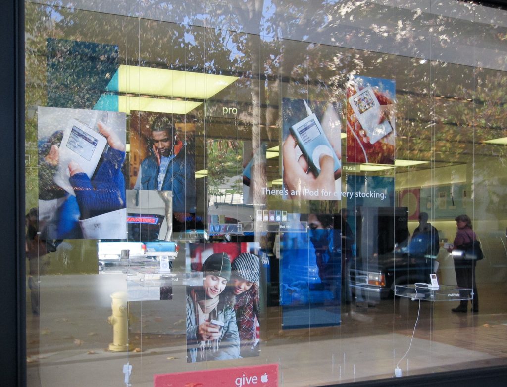
You will fail to grab shoppers’ attention if you continue displaying the same arrangement for months on end. Today, consumption is moving at a lighting rate and you must keep up with it.
Even though frequently changing window displays might seem like a huge task, it’s minuscule compared to the benefits it offers.
So make certain that you switch the display at least once a month and every week during busy seasons.
Don’t be afraid to take risks
Your goal is to stop shoppers’ and make them curious enough to enter the store. So don’t be afraid to take a risk and come up with something with a shock factor. An optical illusion or a teasing element can be just the thing which sets you apart in a sea of competition.

Find Quality Main Pieces
Frequently changing window displays can be expensive. To keep this cost in check, you should invest in a few quality pieces such as lighting, backdrop, furniture, stands and so on. These pieces should be versatile enough to work with different display themes throughout the year.
In addition, you should purchase sturdy storage containers to keep your props and other decors in mint condition. It’s an economical way to keep up with changing display seasonally.
Analyse Your Efforts
Just putting up a display is not enough. You need to determine its impact and if it’s actually driving sales. Maintain a record of how different displays influence consumer behaviour. Analysing this will help you discover the theme that works best for your store.

Be inspired
It’s not easy to constantly come up with new concepts every time. But thanks to the internet, you have access to a plethora of inspiration from across the world. Go through Instagram and Pinterest to find the newest ways to window display your products. You can create your own mood board and pin exciting ideas.
Even when you’re walking on the street, pay attention to your surroundings and take a picture of anything that inspires you. Who knows, a graffiti wall or the lettering on a taco stand might get your creative juices flowing.
The bottom line
With such intense competition from the e-commerce industry, retailers must utilise window displays to their full advantage. This creative tool could be the very difference between a prosperous future and a tragic shut down.
It is a temporary and economical change with significantly greater value. So, make the most of it.


